Definition of environment: the circumstances, objects, or conditions by which one is surrounded
I like to take photos spontaneously of things I see around me in the environment that look interesting or colourful. My favourite thing to photograph is nature, capturing the colours and textures of flowers, plants and trees. I really enjoyed the work of the photographers of nature we looked at for this topic - especially Guy Tal, Pep Ventosa and Mika Ninagawa. I would not have thought of photographing fish before but the colours, light and composition of Ninagawa's images inspired me and I really enjoyed taking shots of colourful fish in my response and playing with light, reflection and movement. I also liked exploring new ways of looking at and photographing buildings inspired by Andy Yeung's dramatic use of perspective and Romain Jacquet-Lagreze's juxtaposition of nature and human-made structures.
I like to take photos spontaneously of things I see around me in the environment that look interesting or colourful. My favourite thing to photograph is nature, capturing the colours and textures of flowers, plants and trees. I really enjoyed the work of the photographers of nature we looked at for this topic - especially Guy Tal, Pep Ventosa and Mika Ninagawa. I would not have thought of photographing fish before but the colours, light and composition of Ninagawa's images inspired me and I really enjoyed taking shots of colourful fish in my response and playing with light, reflection and movement. I also liked exploring new ways of looking at and photographing buildings inspired by Andy Yeung's dramatic use of perspective and Romain Jacquet-Lagreze's juxtaposition of nature and human-made structures.

Composition
The arrangement of elements in a photograph is known as composition. It's the artist's placement of certain elements within a frame that determines whether or not a photograph is appealing to the viewer. A good picture can blend a variety of elements into an nice image.
The arrangement of elements in a photograph is known as composition. It's the artist's placement of certain elements within a frame that determines whether or not a photograph is appealing to the viewer. A good picture can blend a variety of elements into an nice image.

Rule of Thirds
The Rule of Thirds is a technique for splitting a picture into thirds by creating two horizontal and two vertical lines over it. This hypothetical grid divides into nine parts, each with four intersection points. When the most essential elements of the image are placed at these intersection points, the image becomes even more natural.
The Rule of Thirds is a technique for splitting a picture into thirds by creating two horizontal and two vertical lines over it. This hypothetical grid divides into nine parts, each with four intersection points. When the most essential elements of the image are placed at these intersection points, the image becomes even more natural.

Layers
Layers are used in digital image editing to separate different elements of an image. A layer can be compared to a transparency on which imaging effects or images are applied and placed over or under an image.
Layers are used in digital image editing to separate different elements of an image. A layer can be compared to a transparency on which imaging effects or images are applied and placed over or under an image.

Triangles
Triangles are an excellent way to group three points in a picture and organise them to convey a certain effect.
Triangles are an excellent way to group three points in a picture and organise them to convey a certain effect.
When a picture has subject areas that seem balanced in the composition, it is said to be balanced in photography. That is accomplished by rotating the frame and juxtaposing subjects within it in such a way that objects, tones, and colours are visually identical.
Sebastian Magnani

|

|
Sebastian Magnani takes photographs of mirrors in nature and uses reflections to show the contrast between the two aspects of the picture - the background and the reflection.
This makes each contrasting image appear more striking than it would be on its own.
This makes each contrasting image appear more striking than it would be on its own.
My response to Magnani


|


|
These are my pictures inspired by Sebastian Magnani, I used a mirror to capture a reflected vibrant image of nature that contrasted with the dark plain background. I focused only on the mirror and created a blurry background to heighten the contrast and to direct the viewer's attention to the image in the mirror.
WWW: Good use of depth of field and mirror effect is achieved well
EBI: The background was more creative and interesting and contrasted more with the mirror image
EBI: The background was more creative and interesting and contrasted more with the mirror image
Andy Yeung

Andy Yeung's photos are extremely impressive and on a very large scale. They show architecture and cityscapes seen from unusual or dramatic perspectives.
|

In this photo, Yeung is using angles and perspective to make the viewer feel small and see just how impressive these pieces of architecture are.
|
I think that Andy Yeung's photos use perspective and scale really effectively to capture the volume and size of large scale buildings and to draw the viewer in. Below are some of my photos inspired by Andy Yeung showing buildings taken from a dramatic perspective to make them look more impressive.

|

|

|
|
WWW: Photos are colourful and bright and low angle is used well to make the building appear larger
EBI: Taller buildings as the subject to create a more imposing effect and more creative editing e.g. making a mirror image to make it look like the building was surrounding the viewer
EBI: Taller buildings as the subject to create a more imposing effect and more creative editing e.g. making a mirror image to make it look like the building was surrounding the viewer
Romain Jacquet-Lagreze

|

|

My response to Jacquet-Lagreze
|
|
Above are a selection of of Romain Jacquet-Lagreze's photos from his collection Wild Concrete. I like these images because they juxtapose nature and human-made structures and it shows the power of nature and how it will try to grow anywhere and overcome the attempts of humans to master the world around us. On the left and below are photos I took in response to Jacquet-Lagreze. I like how the plants look almost like they are actually moving to take over the space. |


|

|
WWW: Good contrasting textures between buildings and plants
EBI: Larger, more run-down buildings were used instead to recreate the same effect as Jacquet-Lagreze
EBI: Larger, more run-down buildings were used instead to recreate the same effect as Jacquet-Lagreze
Independent development
Matt Barnes

|

|
I like Matt Barnes's work because of the striking composition and the use of lighting to create atmosphere. The entire photo is nearly pitch black except for the subject which is the petrol station. The neon colours of the station contrast dramatically with the pitch blackness of the rest of the picture. I think Barnes creates a unique effect making the scene appear lonely and desolate.
My response to Barnes


This is my work inspired by Mark Barnes. I have taken pictures of a petrol station late at night contrasting the brightness of the petrol station lights with the darkness of the night sky and surrounding street. My intention was to respond to Barnes and how he evokes a sense of isolation. I tried to recreate his composition and use the same subject - a petrol station at night.
WWW: Good use of lighting from the station
EBI: More balanced composition - e.g. if there was more sky than ground in shot - and different exposure to make it darker to express my intention of evoking loneliness
EBI: More balanced composition - e.g. if there was more sky than ground in shot - and different exposure to make it darker to express my intention of evoking loneliness
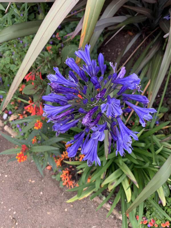
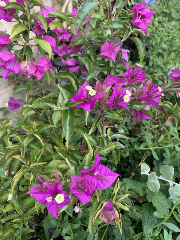
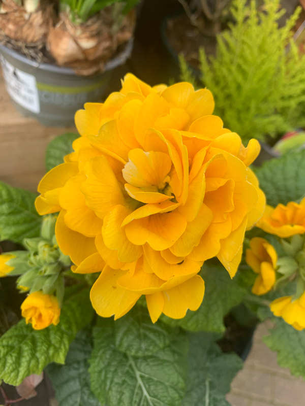
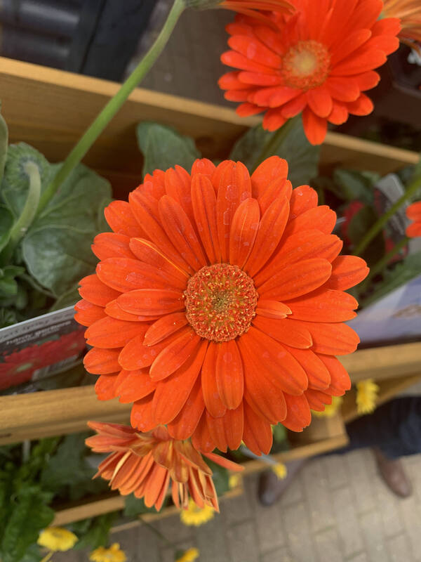
Guy Tal

|

|
I like Guy Tal's work because the images are extremely colourful and vibrant. This makes his landscape photos very captivating and inviting to the viewer and reminds us of the incredible beauty of nature. I personally think that the colours are the best thing about the photos.

My response to Tal

These are some of my photos in response to Guy Tal.
I tried to capture vibrant, colourful flowers that are crowded together or look like a carpet of nature like in Guy Tal's photos.
I tried to capture vibrant, colourful flowers that are crowded together or look like a carpet of nature like in Guy Tal's photos.

|

|
|
|
This is a slideshow of more of my photos inspired by Guy Tal.
|
WWW: Good use of light to create colourful and bright photos
EBI: I created more depth of field in the photos and I experimented with more subjects not just flowers e.g. landscapes
EBI: I created more depth of field in the photos and I experimented with more subjects not just flowers e.g. landscapes
Pep Ventosa
Pep Ventosa was born in 1957 in Barcelona, Spain and he now lives in California.
He says "I like exploring the space between photography and painting, using photographs as raw material to create new visual experiences". He does this by deconstructing and reconstructing images to create a new and unique image. He uses a technique called ‘in the round’ where he takes a large number of images of a subject at different angles and combines them in layers to produce an image that is more like a drawing or a painting than a photograph. Pep Ventosa creates surreal impressionistic images, making a photograph look like a painting by blending multiple images to create a composite. He wanted us to consider how a photograph can look like a painting and evoke how we see an image in time and space. Pep Ventosa has used digital manipulation techniques to create this blurred, painting-like effect.
He says "I like exploring the space between photography and painting, using photographs as raw material to create new visual experiences". He does this by deconstructing and reconstructing images to create a new and unique image. He uses a technique called ‘in the round’ where he takes a large number of images of a subject at different angles and combines them in layers to produce an image that is more like a drawing or a painting than a photograph. Pep Ventosa creates surreal impressionistic images, making a photograph look like a painting by blending multiple images to create a composite. He wanted us to consider how a photograph can look like a painting and evoke how we see an image in time and space. Pep Ventosa has used digital manipulation techniques to create this blurred, painting-like effect.

|

|

This is some of Ventosa's work using his technique of walking around a subject in a 360 circle taking photographs, and then combining all the shots in a multi-layered final image. I especially liked his images of trees as he makes them look so beautiful and unusual looking. I think that his technique is very unique and interesting and that he is a very creative photographer.
Below are some of my images inspired by Pep Ventosa. I created these using photoshop and the "Soft Light" tool.
My response to Ventosa
|
|


|


|

|

|
WWW: Good editing work to create the same effect as Ventosa
EBI: I chose a more interesting subject to photograph
EBI: I chose a more interesting subject to photograph
Development
I have combined Ventosa's technique of layering images with the colourfulness of Guy Tal's images of nature for my development.
This is my development of Guy Tal, I have combined his techniques with Pep Ventosa. The colours and contrast of Guy Tal work nicely with Ventosa's layering technique.


|


|

|

|


|

|


|
|

|
|

|
|
This is how I edited the Ventosa inspired pictures using photoshop and the "Soft Light" tool.
|
Further development
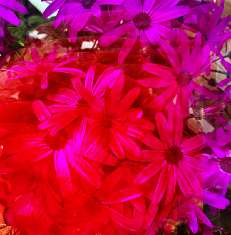
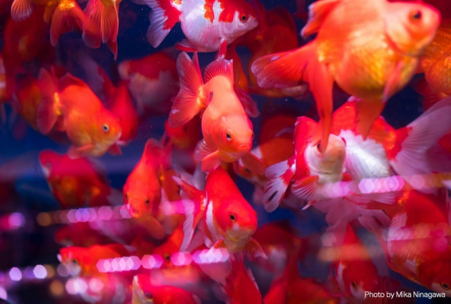
Mika Ninagawa
Mika Ninagawa is a Japanese photographer and director who takes brightly coloured photographs of flowers, goldfish, and landscapes. Her work, like Guy Tal and Pep Ventosa, is bright, colourful and very abstract and unique. She also, like Ventosa uses overlaying to create an image containing two photographs on top of one another.

|
|
This slideshow below shows the photographs I took in response to Mika Ninagawa. My intention was respond to Ninagawa by photographing a similar subject - fish swimming in a tank - and using editing to create an intense colour effect. I experimented with movement, light and colour to recreate Ninagawa's vibrant, colourful effect.
My response to Ninagawa
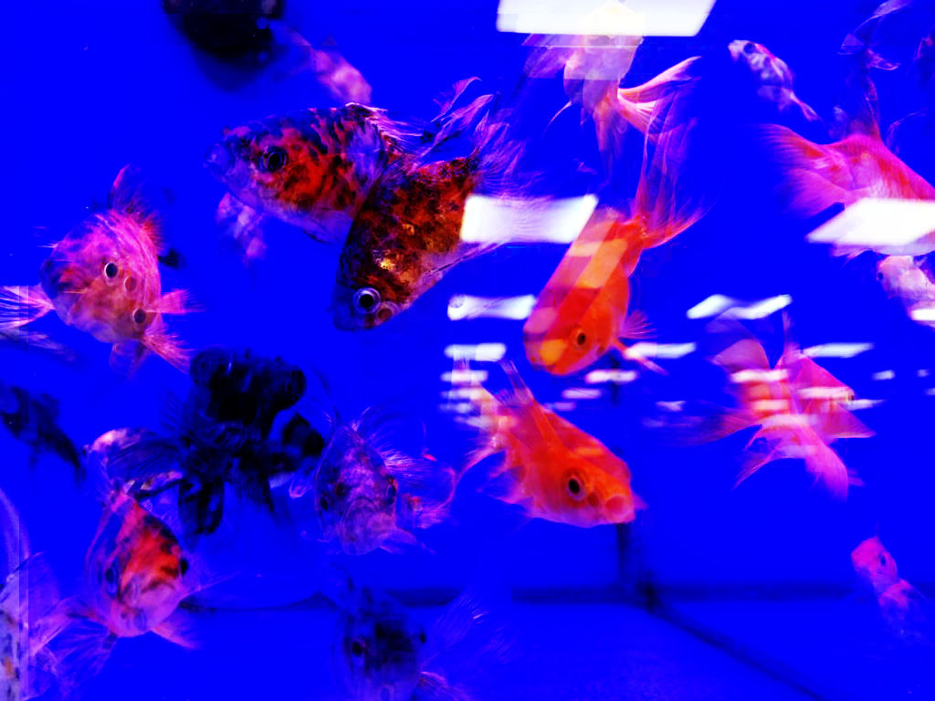
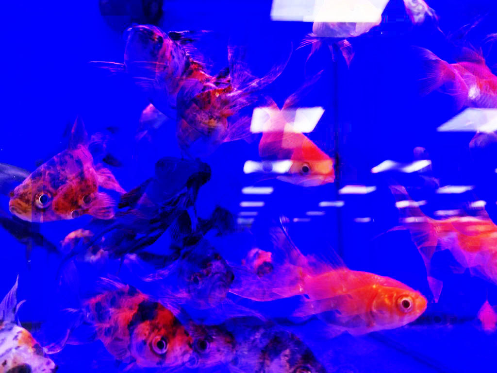
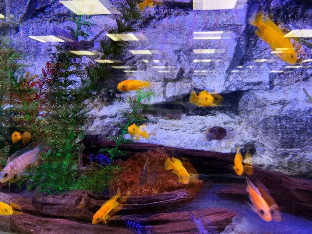
WWW: Good editing and intense colours
EBI: The effect wasn't so blurry
EBI: The effect wasn't so blurry
Final piece


