Definition of fragment: a part broken off, detached, or incomplete
We began looking at the theme of fragments with a series of workshops in class that explored fragmenting portraits and the landscape.
We looked at the work of JR, Kehinde Wiley, Alma Haser and Nicholas Kennedy Sitton among others. The photographer that was most significant to me was JR.
Our class visited his exhibition at the Saatchi gallery and I was struck by the power of the photographs, striking black and white portraits of faces that challenge you to look, and by the subjects of the photos - young black people facing exclusion and prejudice.
Around the same time, I saw a exhibition at the Serpentine gallery of the work of James Barnor, a Ghanaian photographer whose portraits and photo-journalism captured the lives, culture and fashion of of black people in London and Ghana in striking black and white and exuberant colour photos. Both of these exhibitions made me realise the power of photography to capture a person's essence, to show us hidden lives and cultures, and to challenge our prejudices.
JR Chronicles – Saatchi Gallery

|
|
JR started off as as a teenage graffiti artist who painted graffiti in public spaces and on subway trains in Paris. He says "I came from an environment where there was no art at all". When he found a camera on the metro he started taking photos of his friends and his world. Aged 17, he began pasting photocopies of his photographs on street walls, creating illegal ''sidewalk gallery exhibitions''
Between 2004 and 2006, JR created Portraits of a Generation, a series of portrait photographs of young people from poor housing projects that he blew up into large posters to exhibit on the streets of Paris. JR's portraits challenges us to see people and the world differently. He uses "the largest art gallery in the world" exhibiting freely in the streets and has always allowed the public to assist with his street artwork. He prefers to catch the attention of people who are not typical museum visitors and strives to make invisible people - the poor, the excluded,the forgotten - visible, challenging the stereotypes we see in advertising and the media. |
Portraits of a Generation in particular is about showing that people have many aspects to their personality. JR took stark black and white portraits of people from the housing projects, young immigrants and people that took part in the 2005 riots in the suburbs of France. He asked his subjects to pull scary or silly faces and pasted blown-up posters of the portraits on walls and building in the districts of Paris. The portraits were intended to challenge the media representation of the rioters as mindless vandals by inviting us to look into their faces of and seeing real people with lives and personalities.
My response to JR
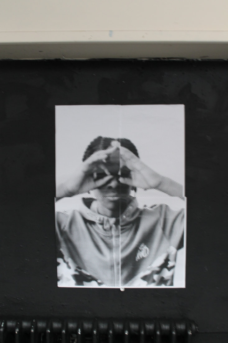
These are my photos inspired by JR. My intention was to recreate the faces of the subjects in JR's photography . I tried to capture different aspects of my subject's personality and show him looking scary, jokey and challenging.
I used the Rasterbation effect and created an enlarged poster that I hung on different backgrounds. I like the black background best as the contrasting colour draws the eye to the white poster making it more visible and the image more striking.
WWW: My subject's pose is jokey and provocative like JR's
EBI: I had displayed the poster in outdoor, interesting places
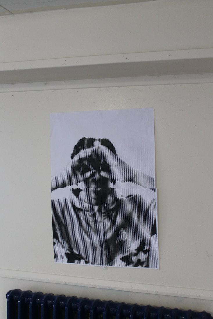
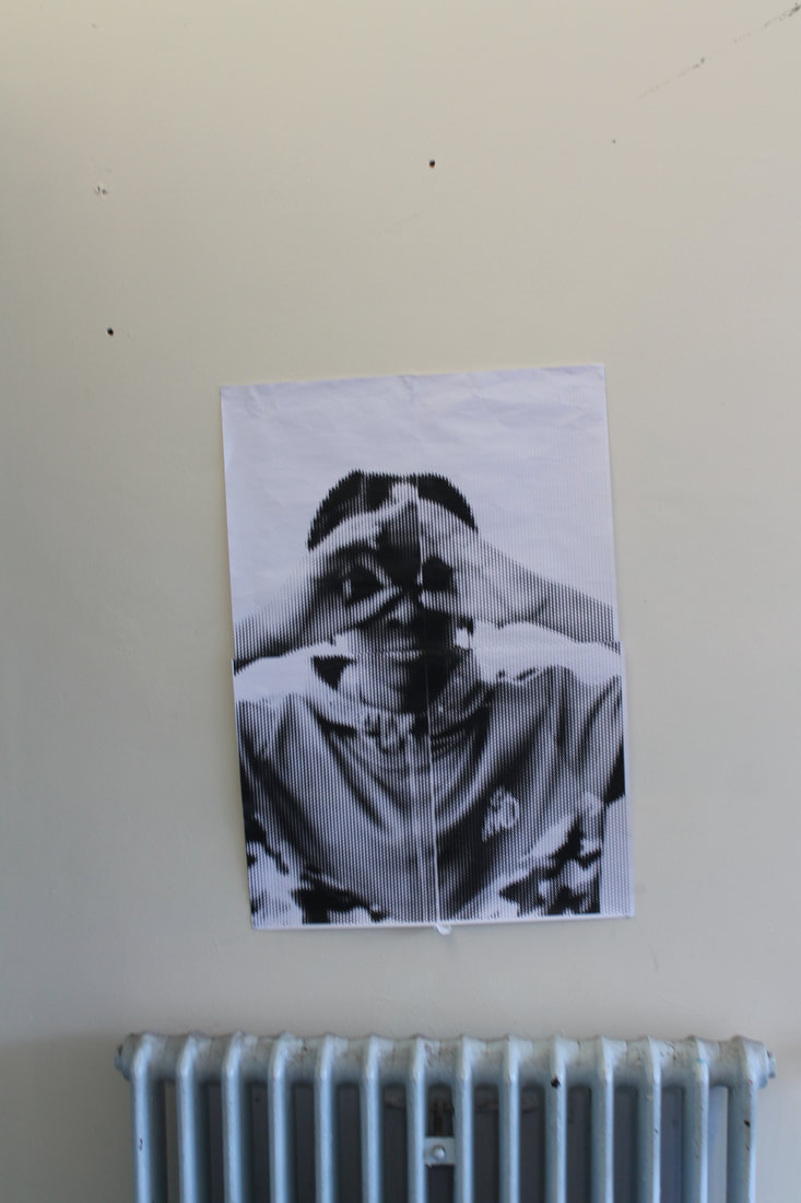
|
|
|

Development
As part of my development, I used a website to add the Rasterbation effect to another of my photos inspired by JR - a self-portrait- to create a grainy, large poster over several pages. I have attached a photo to illustrate how I have done this. Like JR, I displayed my poster in unusual places to add contrast and juxtapose the grainy black and and white image with unexpected and unusual backgrounds.
Gordon Magnin
Gordon Magnin is an American artist who creates altered images from fashion photographs. Magnin makes creative use of geometry, pattern, repetition, form, perspective and composition to distort the original photo and "make the beautiful ugly". He imposes geometric systems like triangles or squares onto the faces, either by cutting them out of the images and replacing them on a new angle, or simply by removing the shapes completely. This has the effect of challenging our perception of these faces and of beauty.

|

|

|
My response to Gordon Magnin


This is my response to Gordon Magnin. I took a portrait photograph of a face against a blank background and used a strong light source to enhance the main subject image. I used Photoshop to remove the central part of the face and replace this with a geometric pattern to digitally create the same effect as Magnin.
WWW: Good editing to get a similar effect to Magnin
EBI: The white sections were not removed from the edit
EBI: The white sections were not removed from the edit
Kehinde Wiley
Kehinde Wiley (born February 28, 1977) is an American artist based in New York City, who is known for his naturalistic paintings of African Americans, frequently referencing the work of traditional Old Master paintings. He was famously commissioned in 2017 to paint a portrait of former President Barack Obama for the Smithsonian National Portrait Gallery. His work juxtaposes old and new, adopting the style of great classical European portrait artists from the past but using people of colour who are rarely seen in those artforms as the subjects. His images question our ideas about power, privilege and identity. Most of all, they highlight the lack of Black subjects historically in European art and seek to rectify this.
These are some of Kehinde Wiley's photos using densely patterned backgrounds to create distinctive portraits of his subjects- often young black men or women in heroic poses.


|

|
My response to Kehinde Wiley
These are my Kehinde Wiley inspired edits. My intention was to take a naturalistic portrait and layer a dense and brightly patterned background to complement the subject and create a more vibrant photograph .
These are my Kehinde Wiley inspired edits. My intention was to take a naturalistic portrait and layer a dense and brightly patterned background to complement the subject and create a more vibrant photograph .

|

|
WWW: The portraits are well lit and focused.
EBI: The editing of the background pattern onto the face of the portrait could be improved.
EBI: The editing of the background pattern onto the face of the portrait could be improved.
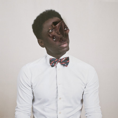
Alma Haser
|
|

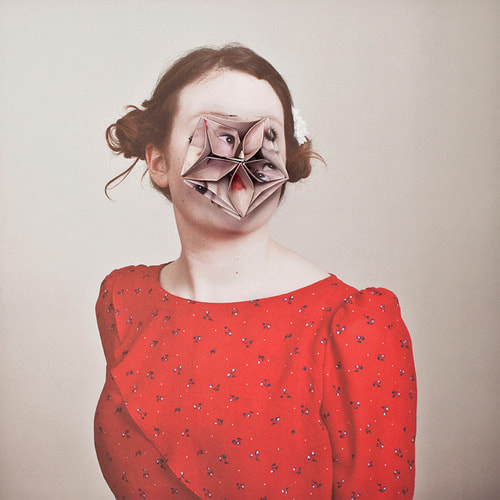
In her series 'Cosmic Surgery' Alma Haser creates surreal pictures using origami to manipulate the faces of her subjects. She wants us to consider the mysteriousness of the face and, in a similar way to Gordon Magnin, to take away our usual points of reference when looking at a person's image.
The oddness of the photos is achieved by the origami editing effect that hides and distorts the face of the subject. This makes the subject look weird and alien and it gives the viewer a sense of uneasiness. The work is powerful as it creates a unique new face for the subject.
The oddness of the photos is achieved by the origami editing effect that hides and distorts the face of the subject. This makes the subject look weird and alien and it gives the viewer a sense of uneasiness. The work is powerful as it creates a unique new face for the subject.
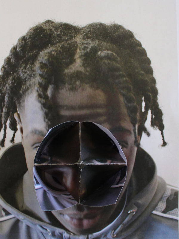
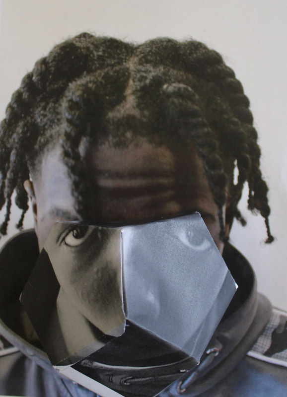
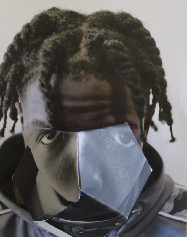
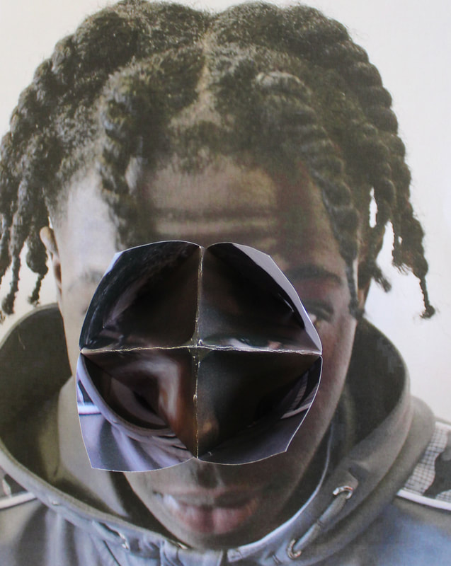
My response to Alma Haser
|
|
|
|
This is my response to Alma Haser, instead of using digital manipulation I have developed it and used origami. The origami creates the same effect as the digital manipulation, but gives a more 3D affect. I like how it creates a completely new face and expression for the subject making him half recognisable and half not.
WWW: Good Origami and placement of said origami.
EBI: The photos could be a higher quality and more focused on the camera.
EBI: The photos could be a higher quality and more focused on the camera.
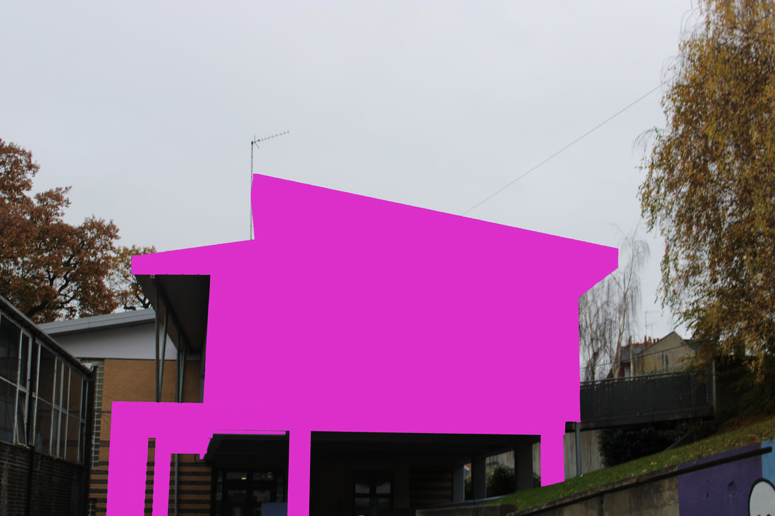
Patrick Cornillet
Patrick Cornillet is a French artist who creates strikingly unusual paintings. He does this by removing the background and replacing the subject on a white background. He wanted us to consider what photos look like without the context of a background and focus purely on our reaction to the main subject of the photo.

|

|
My response to Cornillet

This is my response to Patrick Cornillet.
I used photoshop to edit these and make the background, and everything apart from the main building, into a block of white colour.
My intention was to use this technique to make the buildings look strange without their context and background. The negative space makes them they stand out and encourages the viewer to see these ordinary pieces of architecture as unique and unusual.


WWW: Good editing of the photos and good use of photoshop.
EBI: The photos were more interesting to look at or of more unique buildings.
EBI: The photos were more interesting to look at or of more unique buildings.
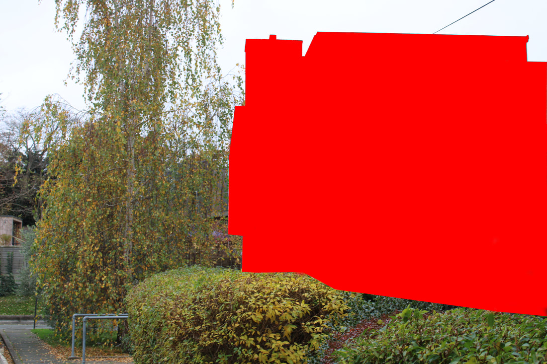
Mauren Brodbeck

|

|
Mauren Brodbeck is an Austrian photographer known for her Urbanscapes. As well as photography, she has studied painting and worked in cinematography and film-making. These additional creative approaches give her a unique approach to her photography.
In Urbanscapes, Brodbeck takes pictures of bland, geometric buildings and uses colour-blocking to add bright vivid colours to bring the building back to life for the viewer and make these structures less forgettable and ordinary. Brodbeck creates vivid imagery, she does this by using bright colours which contrast with the dull background She wanted us to consider the effect of the bright colours on the plain background and appreciate the beauty of these structures. Like Cornillet, her work inspires us to see these pieces of architecture in a new way and challenges the idea that these urban surroundings are tedious.
In Urbanscapes, Brodbeck takes pictures of bland, geometric buildings and uses colour-blocking to add bright vivid colours to bring the building back to life for the viewer and make these structures less forgettable and ordinary. Brodbeck creates vivid imagery, she does this by using bright colours which contrast with the dull background She wanted us to consider the effect of the bright colours on the plain background and appreciate the beauty of these structures. Like Cornillet, her work inspires us to see these pieces of architecture in a new way and challenges the idea that these urban surroundings are tedious.
My response to Mauren Brodbeck
This is my response to the photographs of Mauren Brodbeck. I photographed uninspiring buildings with interesting and unusual shapes. I digitally altered the images using Photoshop. Drawing around the building shape with the lasso tool and then applying vivid colours from the paint bucket to fill the building in.
WWW: The photos are good quality and the colours edited in make the building stand out
EBI: The editing could be improved and neater
WWW: The photos are good quality and the colours edited in make the building stand out
EBI: The editing could be improved and neater
Thomas Kellner
Thomas Kellner is a photographer who specialises in fine art photography. Kellner's art aims to to show a variety of perspectives and viewpoints. He takes pictures of structures and then prints many images onto contact sheets to make an artwork of the building from various viewpoints. Kellner's work relates back to fragments because the pictures he takes are split up into different fragments.


|

|
My response to Thomas Kellner


This is my response to Thomas Kellner, I used pictures of a petrol station and used photoshop to overlay a grid onto it, like Kellner. I have developed it by making it black and white to create an old effect.
WWW: Good editing and accurate to the original photos by Kellner
EBI: A few parts of the editing could be improved and cleaned up.
EBI: A few parts of the editing could be improved and cleaned up.
Three Strands
Development 1
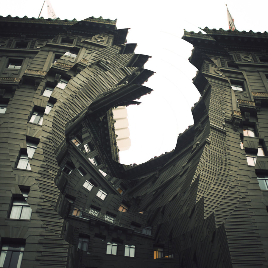
Nicholas Kennedy Sitton
|
|

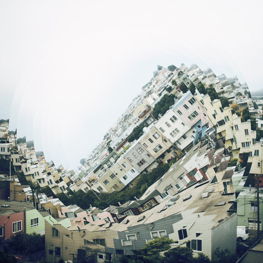
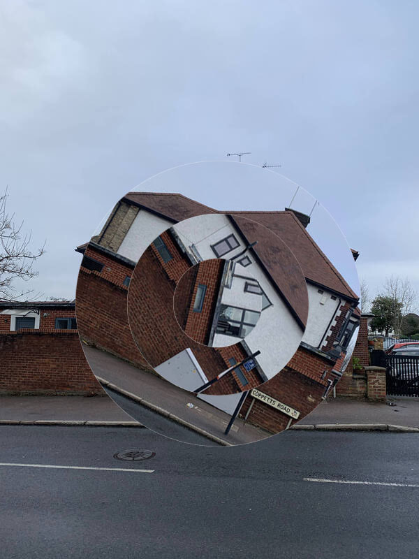
Nicholas Kennedy Sitton creates obscure encapsulating images of ordinary buildings. He does this by digitally editing the original photo to create a new and strange image of the building. He wanted us to consider how distorting an image can make it look and how a normal building can look futuristic and captivating. Nicholas Kennedy Sitton has used digital manipulation techniques in creating this work. This creates a puzzling and unsettling effect. This helps Sitton to show that anything can be manipulated and not to believe everything you see.
My first response to Nicholas Kennedy Sitton
In this task I was required to edit pictures of houses by creating the illusion that they are rotating in the centre. This task links to the theme of illusion as by editing it to make it look like it is spinning it creates an illusion to the viewer as it is not actually spinning. My intention was to respond to Nicholas Kennedy Sitton because I wanted to explore his ideas and illusionary photos.
|
|
This is my first response to Nicholas Kennedy Sitton, I used photoshop to recreate the techniques used by Sitton in his work
WWW: Good use of editing
EBI: I used more interesting taller buildings as my subject to better meet the brief
EBI: I used more interesting taller buildings as my subject to better meet the brief
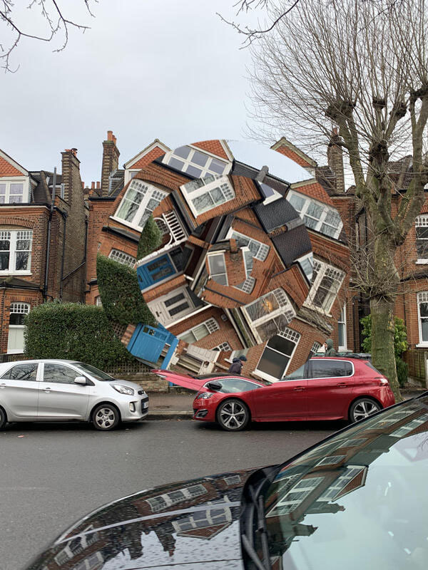
My second response to Kennedy Sitton
|

|
This is my second development on Nicholas Kennedy Sitton. In this task, instead of using regular houses, I went to central London and used a skyscraper instead as this subject better met the brief. I tried to create more depth of field and use better lighting in this development. My intention was to to emulate Sitton's use of distortion to create the illusion that the building is falling into itself.
WWW: The lighting and composition
EBI: Circles created in the editing could be more symmetrical and more in line with one another
EBI: Circles created in the editing could be more symmetrical and more in line with one another
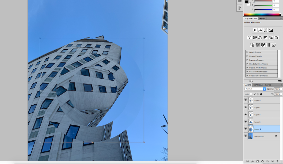
This is an example of how I edited my images on photoshop in order to achieve a similar effect to Nicholas Kennedy Sitton's photos.
Development 2
My first response to Kehinde Wiley
In this task I was required to take a series of portrait pictures and edit these with vibrant patterns inspired by the work of Kehinde Wiley. My intention was to respond to the work of Kehinde Wiley because I wanted to explore using vibrant layers to add interest and fun and juxtapose this with a serious portrait photo and to tell you something more about the subject's personality.

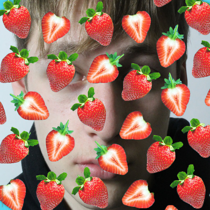
WWW: Good use of light and shadow in the photo. The editing did add colour and fun to the image and helped the subject's character emerge
EBI: My edits did not cover the subject's face and eyes as this makes it hard to see the original portrait
EBI: My edits did not cover the subject's face and eyes as this makes it hard to see the original portrait
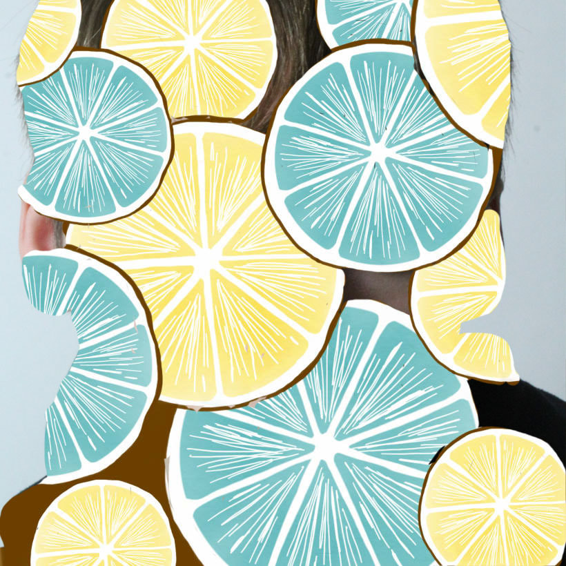
My second response to Kehinde Wiley
This is my second development on Kehinde Wiley. In this task, I tried to create more variety and colour in the edits and to not cover the portrait. My intention was to to emulate Wiley's use of juxtaposition, contrasting a serious subject with a fun, brightly patterned overlay. I wanted to create the illusion of movement so the fruit looks like it's falling and to show, like JR, that people have many aspects to their personality and can be both serious and fun.

WWW: Good editing of the patterns onto the portrait.
EBI: If I had experimented with more patterns
EBI: If I had experimented with more patterns
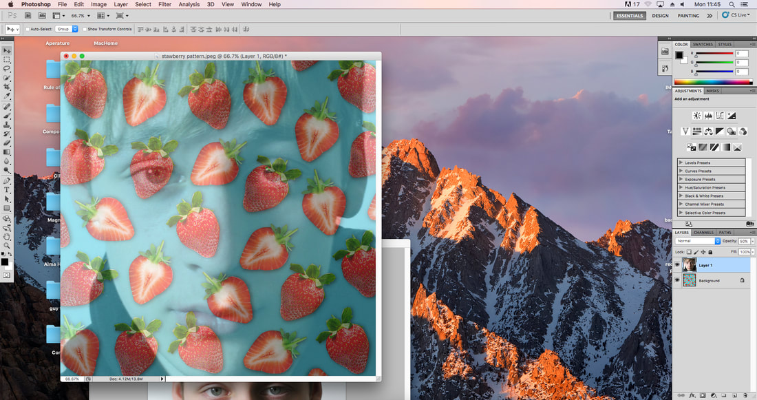
Kenhinde Wiley creates unique images using digital manipulation techniques. I used photoshop to put another layer on top of the picture of the model and edited out the background so you can see both layers, this creates the effect that the pattern is on the person's face and not a separate picture.
In this task I edited pictures by overlaying a pattern onto a portrait of a person. This task links to the theme of creativity and joy as by editing an exuberant, colourful pattern onto a blank expression face it creates a juxtaposition between the two images. My intention was to respond to Kehinde Wiley because I wanted to explore his technique and creative ideas.
|
|
This is the slideshow of all the unedited photos used in making these edits
|
Development 3
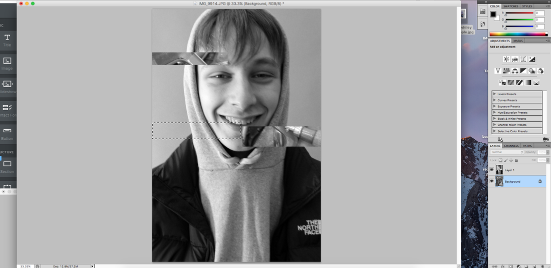
This is one of my development areas where I am editing a portrait photograph to juxtapose images of a person's passions onto their image, for example playing guitar or crafting things. I achieved this effect by using digital manipulation specifically photoshop. I used the "Rectangular Marquee tool" to remove segments of the portrait on top, which reveals the passion underneath.

|

|

|

|

|

|


The process:I used the "Rectangular Marquee tool" to remove segments of the portrait as shown in the screenshot on the right.
WWW: The photographs are technically good with good composition, light, exposure and focus EBI: There was more contrast between the portrait photo and the added segments so each you can see them separately and as part of the whole Development 4In this task, my intention was to improve my edits and create more distinction between my subject and their passions. I achieved this by using circular segments, digitally removing the background to give more focus to the subject and experimenting with colour and black and white images.

|


|

|
|
WWW: The edits are good quality and well done
EBI: The background photos were more creative or expressive.
EBI: The background photos were more creative or expressive.
